Requirement gathering
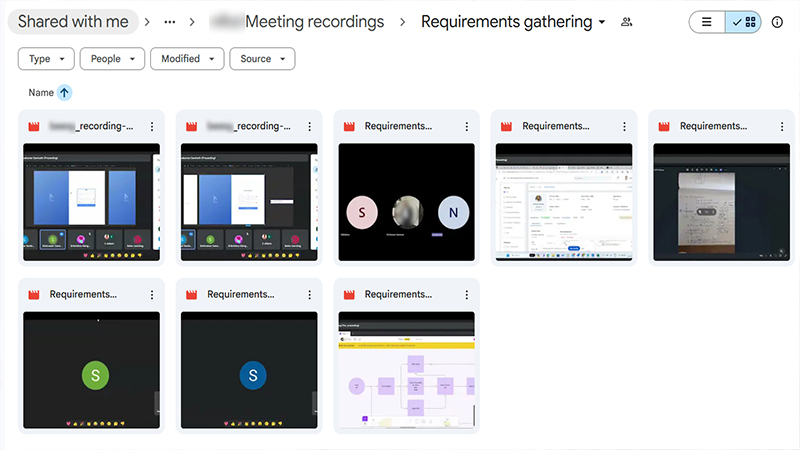
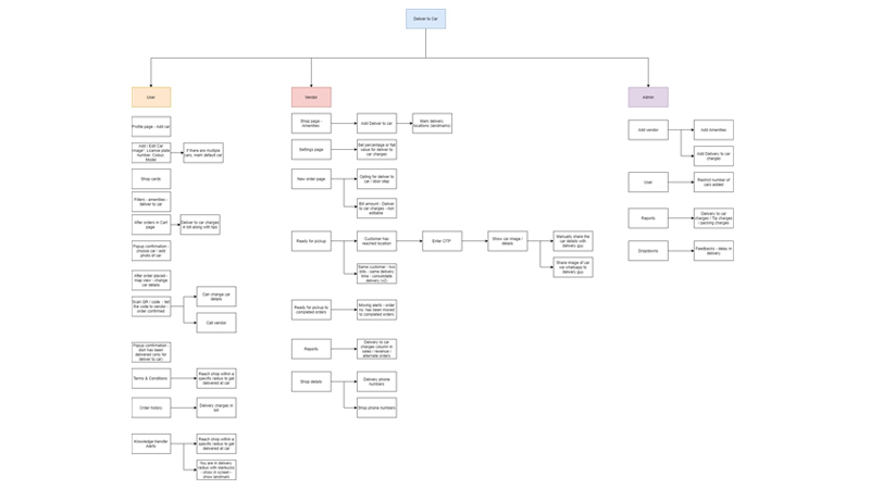
At Ilakku Technologies, our first step is all about Requirement Gathering — diving deep to understand what the project must achieve and building a rock-solid foundation for everything that follows. We sync with stakeholders, ask the right questions, actually listen, and document business, functional, and technical needs with clarity. This stage also includes creating detailed mind maps, identifying user segments, and shaping personas so we know exactly who we're designing for and why. It's the blueprint that sets the direction, reduces surprises, and keeps the whole project moving with purpose.
User Qualitative Analysis
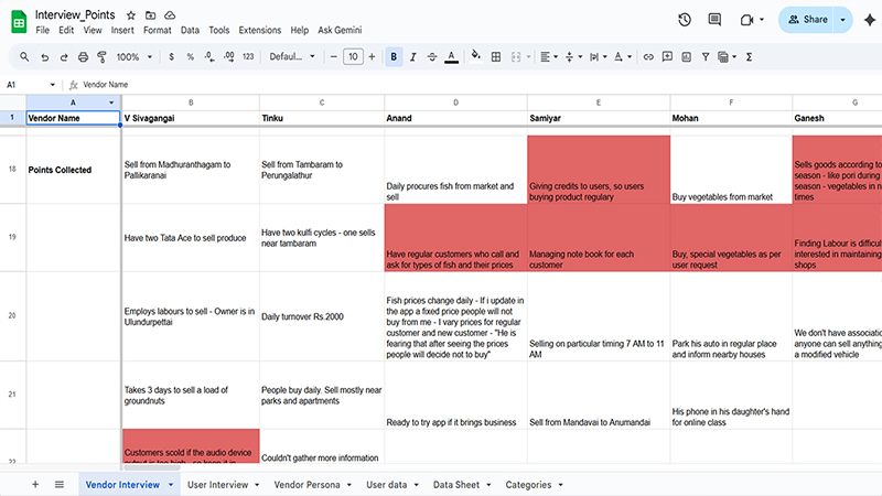
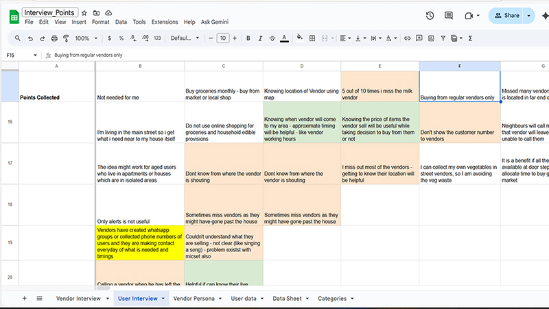
We interviewed different user segments and ran a Qualitative Analysis to uncover their real motivations, pain points, and workaround behaviors. These insights were translated into clear, actionable personas and user journey maps that directly inform our design decisions.
Quantiative Data Analysis
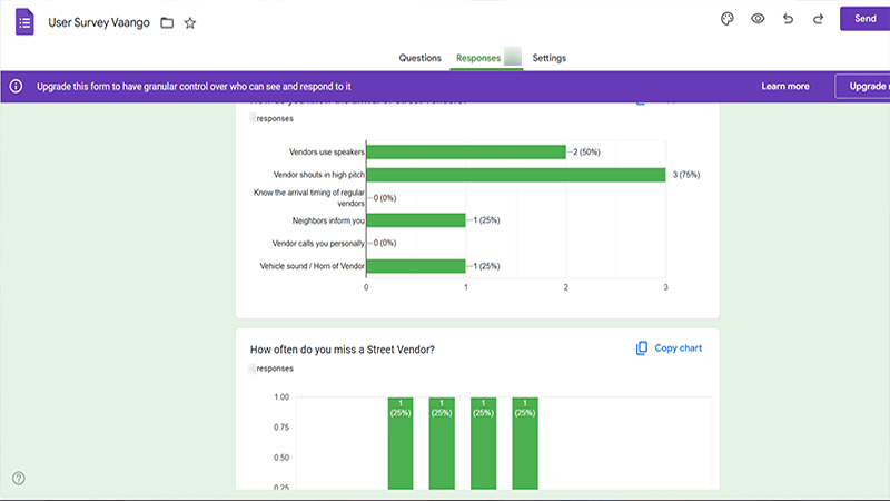
To validate our qualitative findings, we conducted a quantitative survey with a larger group of users. The survey results helped us clearly see which features were most important and confirm our assumptions about user behavior on a bigger scale. We used these insights to make informed decisions about our feature list.
Competitor Analysis
We analyzed both direct and indirect competitors to identify market gaps and understand current industry standards. As part of this process, we conducted a comprehensive feature audit outlining what works well, what doesn't, and what could be improved. This gives the client an “à la carte” view of potential functionalities, helping them select exactly what they want to include. Once the features are chosen, we guide the client through card-sorting sessions focused on version planning—starting with the MVP. This ensures we capture every required feature and clearly define what belongs in each release. By organizing features version-wise upfront, we avoid missing critical functionality and gain full clarity on when each feature will be introduced. Before every version begins, we revisit and refine the information architecture to confirm that priorities, structure, and user flows still align with the product's goals.
Information Architecture
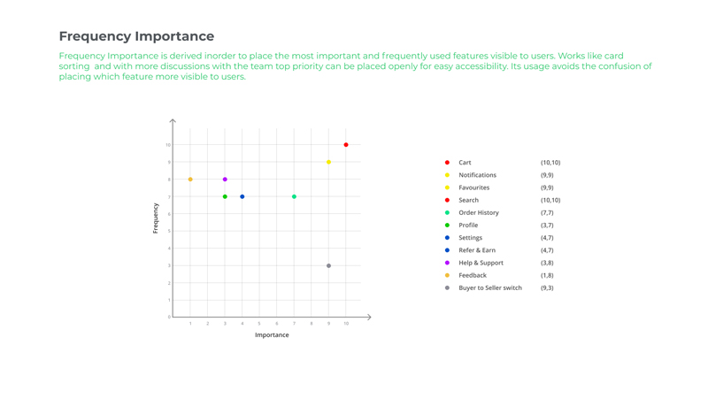
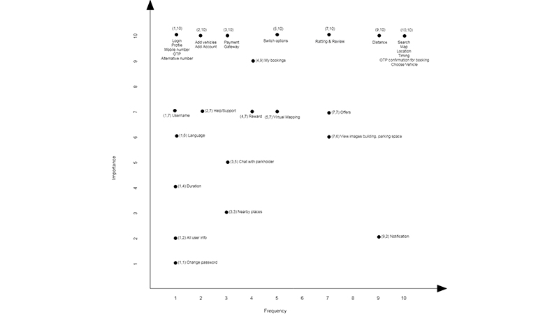
We refine information architecture from the ground up or enhance it for existing products, ensuring it aligns with how users naturally think and navigate. For this project, we conducted both online and offline card-sorting sessions to understand how people intuitively group information. These insights helped us shape a clear sitemap and user flows that reflect real user mental models. We also applied a frequency–importance curve to structure the content. This ensured that high-priority and frequently used information appears upfront, while lower-priority items stay in the background without creating clutter or confusion.
Conceptual Model
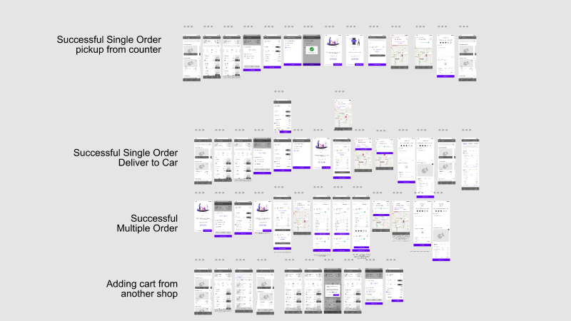
We translated the concepts into working models that focused solely on functionality, structure, and user flow. This helped us visually interpret the client's needs and give them a clearer understanding of how the solution would work. These early models also allowed us to explore how features are interconnected across different logins and assess how a change in one area might impact others. At this stage, we work purely on function—no visual styling is introduced. Once the direction is finalized, we move into detailed wireframes (both low-fidelity and high-fidelity), followed by mood boards to define the visual direction before progressing into full UI design.
Low fidelity and High fidelity
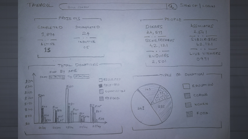
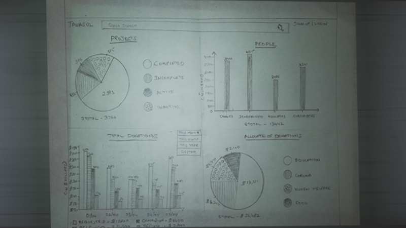
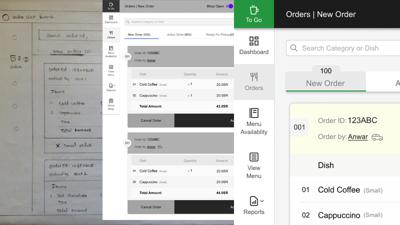
We began with low-fidelity sketches to quickly explore layout options, user flows, workflows, and task flows. This allowed us to validate the structure and functionality early. Once the direction was clear, we transitioned to high-fidelity mockups to visualize the final look and feel with accuracy and detail.
Wire frame evolution
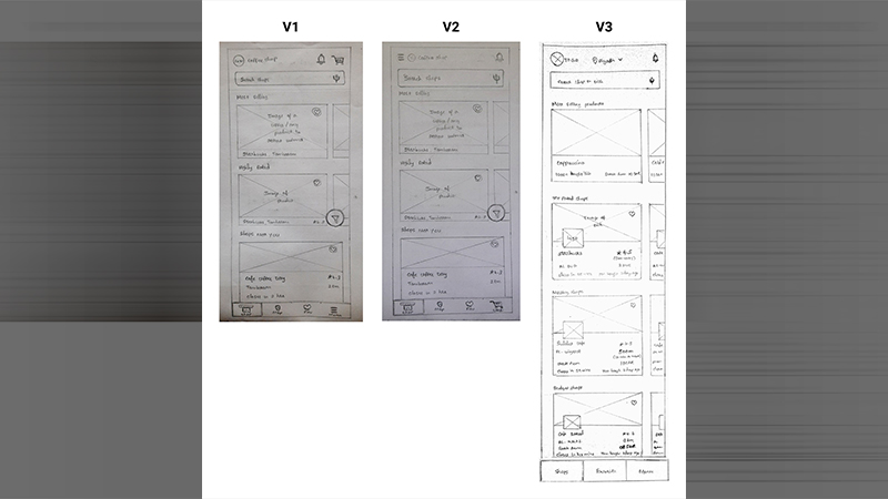
Our wireframes went through multiple feedback cycles to refine usability and ensure every functional requirement was fully addressed before moving into visual design. This iterative approach greatly reduced rework later in the process. We design around complete user flows, allowing us to identify and resolve any missing elements early. Our guiding principle is that users should reach their goals within three clicks, so we structure the information architecture to support that. The wireframes are crafted to clearly reflect this streamlined, goal-driven navigation.
Design System
We built a scalable design system that includes cards, typography, color palettes, spacing guidelines, and a library of reusable components. This framework ensures consistency across the entire application and accelerates future development. Our team follows a strict practice of creating all elements within the design system, maintaining uniform standards and design integrity throughout the project.
User Interface Design
Building on the approved wireframes, we designed a clean, modern, and accessible user interface using our established design system. We tailored the navigation to align with users' goals and personality traits, creating a personalized experience for each individual. This ensured a smooth, intuitive, and user-focused journey across the product.
Functionality Specification Document
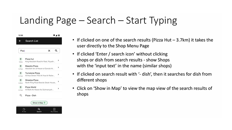
We thoroughly documented every detail of the design, including component states, interaction logic, and accessibility requirements. This Functional Specification Document (FSD) acted as the single source of truth for the development team, ensuring clarity and consistency throughout the build process.
Request For Change Handling
We handle change requests through a structured review process. First, we analyze the client's need and assess how the update impacts all user roles and system touchpoints. Even a simple one-line request can have deeper technical or functional implications, so we carefully estimate the actual effort involved. Once the effort and timeline are defined, we share the estimation with the client for approval. After the change request is formally confirmed, we proceed with implementing the new updates.

